UX Best Practices for Creating Sign-up Forms in Mobile Apps

In the mobile-centric world we live in, the sign-up form is often the first interaction a user has with an app. It's a make-or-break moment for many, where the balance between user friendliness and data collection plays a crucial role. For app developers and designers, creating an effective sign-up form is critical. Here are some best practices to ensure your mobile app's sign-up form enhances the user experience (UX) and encourages successful conversions.
1. Simplify the Process
Minimize Fields: Every additional field in a sign-up form can decrease the likelihood of completion. Ask only for essential information. Consider what you truly need at this stage—often, an email address and password suffice.
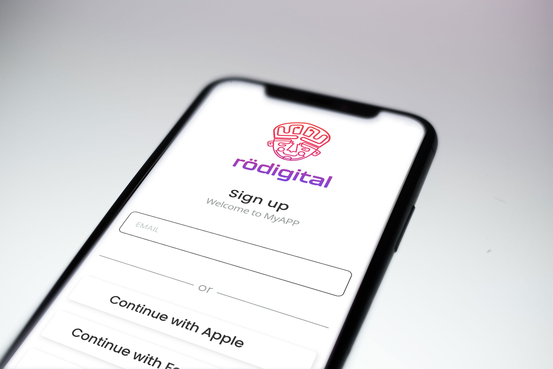
Social Media Logins: Integrating social media logins can streamline the sign-up process. Allowing users to sign up with existing Facebook, Google, or Apple profiles can significantly reduce friction and time spent on filling out forms. It's important to note that if you are planning to publish your app in the App Store, you must add support for Apple's Single Sign-On in addition to other methods.
2. Design for Mobile Usability
Touchable Areas: Ensure that form elements are easily tappable on a mobile screen. Apple recommends a minimum tappable area of 44 pixels wide by 44 pixels tall. This size prevents users from tapping the wrong field and enhances the overall usability.
Keyboard Considerations: Automatically trigger the appropriate keyboard for each text field. For instance, show a numeric keyboard for phone numbers and an email-optimized keyboard for email address fields. This attention to detail can significantly enhance the user experience.
3. Optimize Form Layout and Structure
Single Column Layout: A single column layout is more straightforward for users to navigate on mobile devices. It keeps the user's focus on one item at a time and reduces the need for scrolling horizontally.
Group Related Information: Logical grouping of related information can help users understand the form's structure better. For example, putting all personal details together and separating them from login information can make the form appear less daunting.
4. Streamline the Registration Process
Simplify Your Form: Keep the form straightforward and user-friendly. Offering users options during the sign-up process enables them to create an account swiftly and with ease. Why navigate through lengthy forms when a few clicks will suffice? Initially, focus on only the necessary information, excluding any non-essential elements.

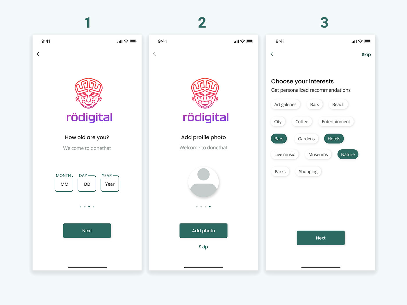
Multi-Step Forms for Better Clarity: If additional information is needed and can be logically organized, consider implementing a multi-step form approach. Users expect a seamless and uncomplicated sign-up experience, devoid of the frustration associated with long, time-intensive forms. An optimal sign-up page design offers a variety of sign-up methods, allowing users the freedom to choose their preferred method of account creation and breaking down the registration into digestible steps.
5. Provide Instant Feedback
Inline Validation: Offer real-time validation for email addresses, passwords, and other fields. If a user inputs something incorrectly, immediate feedback can prevent frustration later on. For example, if a password doesn't meet the app's requirements, tell the user right away.
Success Indicators: Once a form is successfully submitted, provide clear confirmation to the user. Whether it's a message, an animation, or transitioning to another screen, it should be clear that the action was successful.
6. Prioritize Privacy and Security
Transparent Policies: Make sure users understand what their information will be used for. Provide links to your privacy policy and terms of service in a non-intrusive, yet accessible way.
Password Security: Guide users to create strong passwords without making the process too cumbersome. Offering a password strength indicator can encourage users to create more secure passwords without additional frustration.
7. Test and Iterate
User Testing: Conduct usability tests to gather feedback on your sign-up form. Observing real users as they interact with the form can unveil issues you might not have anticipated.
A/B Testing: Try different versions of your sign-up form to see which performs better. Small changes, like the wording of your call-to-action button or the color of the form fields, can have significant effects on conversion rates.
8. Implement Two-Factor Authentication (2FA)
Enhancing Security: Two-Factor Authentication (2FA) adds an additional layer of security to the sign-up and login processes. By requiring users to provide two different authentication factors—a password and a second factor, typically a temporary code sent via SMS or generated by an authenticator app—2FA significantly reduces the risk of unauthorized access to user accounts. This security measure is crucial for protecting sensitive user information and preventing identity theft.
Why 2FA is Important: In an era where data breaches are increasingly common, a strong password alone is often not enough to safeguard accounts. 2FA ensures that even if a password is compromised, unauthorized users cannot gain access without the second authentication factor. This is especially important for apps that handle financial transactions, personal data, or sensitive information, where the consequences of unauthorized access can be severe.
Applicability of 2FA: While 2FA is highly recommended for enhancing security, its implementation should be considered based on the app's context and user needs. For apps dealing with sensitive information or requiring high-security measures, 2FA is essential. However, for less sensitive applications, developers might opt for a more flexible approach, enabling 2FA as an optional security feature for users who wish to use it. It's important to balance security needs with user convenience, as overly stringent security measures can sometimes deter users from completing the sign-up process.
User Education: Educating users about the benefits and operation of 2FA is key to its successful adoption. Clear instructions on how to set up and use 2FA, along with explanations of its importance for security, can encourage users to embrace this additional security measure willingly.
By incorporating 2FA, mobile apps can significantly enhance user account security, building trust with users and protecting them against the increasing threats of cyber attacks and identity theft.
Conclusion
Creating a user-friendly sign-up form for mobile apps is a blend of art and science. By following these best practices, you can design a form that not only looks great but also enhances the user experience, ultimately leading to higher conversion rates and a more successful app. Remember, the goal is to make the sign-up process as seamless and painless as possible, encouraging users to take that first step in engaging with your app.
- WRITTEN BY:Alain Martínez
- POSTED ON:2/22/2024
- TAGS:UX Design


